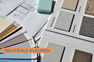
What Are Neutral Colours?
Neutral colours are much more than just shades of white and brown. These colours act as subtle backdrops, making them ideal for pairing with vibrant tones. They provide an open canvas for creative expressions, allowing artwork and architecture to truly come to life. A neutral colour palette can range from light shades like cream and white to deeper tones like chocolate brown and anthracite. We’ve already compiled the most beautiful neutral shades for you!

Did You Know...
Neutral colours are often used as the main colour in a room? These neutral base colours are frequently complemented with vibrant accent colours, for instance, on the skirting boards!
Break Away from Tradition
Neutral colours don’t have to be limited to well-known shades like taupe, nutmeg, or sand. Step outside the traditional choices and explore a world of new possibilities. By opting for alternative hues, you can create a distinctive and personal atmosphere that transcends conventional boundaries. Get inspired by unexpected colour combinations and give your space a refreshing new look.
The Versatility of Neutral Colours in Interior Design
Neutral colours also allow for creativity with textures and materials. By experimenting with various surfaces like wood, metal, or fabric, neutral tones can add depth and interest without overwhelming the space. This makes it easier to incorporate accents and personal details, resulting in a space that feels unique and personal. Using neutral colours also provides the flexibility to change or refresh decor regularly without disrupting the overall aesthetic, making them a perfect choice for both beginners and experienced interior designers.
Benefits of Swedish Red Paint
Professional Swedish Red wall paint is made using the most durable pigments, often sourced from premium materials.
- High-quality binder
- Unique look
- Harmonious colour
- Calming shade
Break Away from Tradition
Neutral colours don’t have to be restricted to familiar tones like taupe, nutmeg, or sand. Venture beyond the ordinary and discover a wealth of new options. By selecting alternative shades, you can craft a unique and personalised setting that challenges conventional norms. Find inspiration in unexpected colour pairings and give your surroundings a contemporary twist.

Tip from Verfmenger
Before starting your project, calculate how much paint you actually need. Remember to account for the surface; an absorbent base, such as plasterwork, will soak up some of the paint, requiring you to use more. That’s why priming the surface beforehand is always a smart idea. This way, you negate the surface’s absorption!
Timeless Elegance With Neutral Colours
Neutral colours offer a versatile base for any interior design, making them perfect for creating a timeless and elegant look. Thanks to their subtle nature, these colours can seamlessly blend with various styles, from classic to modern. They serve as a calm backdrop that allows other elements in a space to stand out, while also fostering a sense of harmony and balance. These colours are ideal for crafting a serene and inviting atmosphere that never goes out of style.


